11 Nov Data Processing: A Discovery Pipeline
The computer scientists working on INSTRUMENT: One Antarctic Night view programming as an art form.
They are also versed in the language of statistics‚ and they provide a valuable translation for the team. Theirs is the task of designing a data engine that allows for both graphic rendering and interaction‚ handling hundreds of thousands of data files to create an immersive art + science experience.

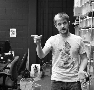
Sam Johnson
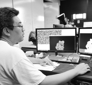
Sam Johnson is a computer scientist with a background in sound processing and virtual environments. I-Chen Yeh is a computer scientist who has been working on immersive data projects at xREZ Art + Science Lab throughout 2016. Together they are working to sort out over 1 million data files by translating the language of photometry and astronomy into the language of bits and bytes.
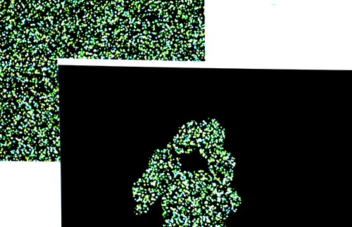
 Chiseling down a mountain of data‚ Johnson and Yeh have re-created images of the sky from data provided by astrophysicists working with robotic telescopes in Antarctica. The datasets obtained by the team include images and hundreds of thousands of associated metadata files including sensor coordinates‚ right ascension‚ declination‚ flux (or intensity of the light)‚ as well as cross-referenced observations on other wavelengths‚ and peta-scale pulsar data.
Re-building the Data Pipeline
The data includes hundreds of thousands of optical observations from the CSTAR telescope‚ and 819‚282 files from AST3 that translate into images containing between 3‚360 and 413‚331 stars each. The AST3 data was captured at 4183 different points in time by telescopes that can take an exposure every two to 30 seconds‚ during the dark Antarctic winter.
Optical star data is processed through photometry‚ filtering the light to determine the precise location and intensity of stars. For astronomers‚ the data is a rich abundance of information that must be processed and filtered in order to obtain meaning‚ and much of the data is discarded in the process.
For computer scientists working on the INSTRUMENT project‚ their art is a process of reverse-engineering a trail backwards up the pipeline of discovery‚ re-tracing the steps of the scientists to move from the dataset back to the essence of the raw material. Providing the team with raw material means making the data readable‚ sortable‚ and usable so the INSTRUMENT team can build new and interesting uses of the data for scientists and the public.

I-Chen Yeh
They sort data using statistics to develop a new language for talking about data structures. They are also futurists‚ thinking about whether what they build will work later down the line as surrounding developments unfold. They need a tool that is relevant‚ usable‚ and durable through changes and increasing amounts of incoming data.
Designing An Interaction Interface
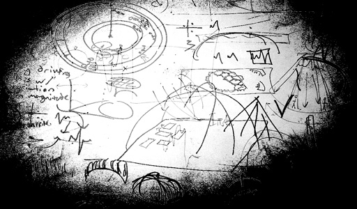
On the INSTRUMENT project‚ these programmers are translating ideas into the language of technology through working closely with designers and iterating different ideas for the data-interaction. As new questions arise in the team’s interdisciplinary discussions‚ the data processors mold their programming around the shape of the data‚ working with the team to determine what is possible to create. The idea is to build something beyond just science or just art‚ but combining the tools offered by both.
“You can reveal the star or black out the star – that’s just the difference between a 1 and a 0‚” says I-Chen Yeh of his work programming the system to respond to human interaction.
The sheer number of files that must be processed by the system present design challenges. For instance‚ graphically rendering 400‚000 objects at once requires a robust system with the right combination of hardware and software to perform at processing speeds that allow real-time interaction.
The physics of the virtual environment also must line up with the user’s proprioception‚ so the way they move in relation to the surrounding context makes sense and they are able to manipulate the space effectively. The team is conquering these and other programming challenges inherent in dealing with large data sets‚ working to make them visually accessible to the public as well as the scientists who created them.
Learn more about the project: “Data Sounds: The Music of Statistics“

